The Challenge

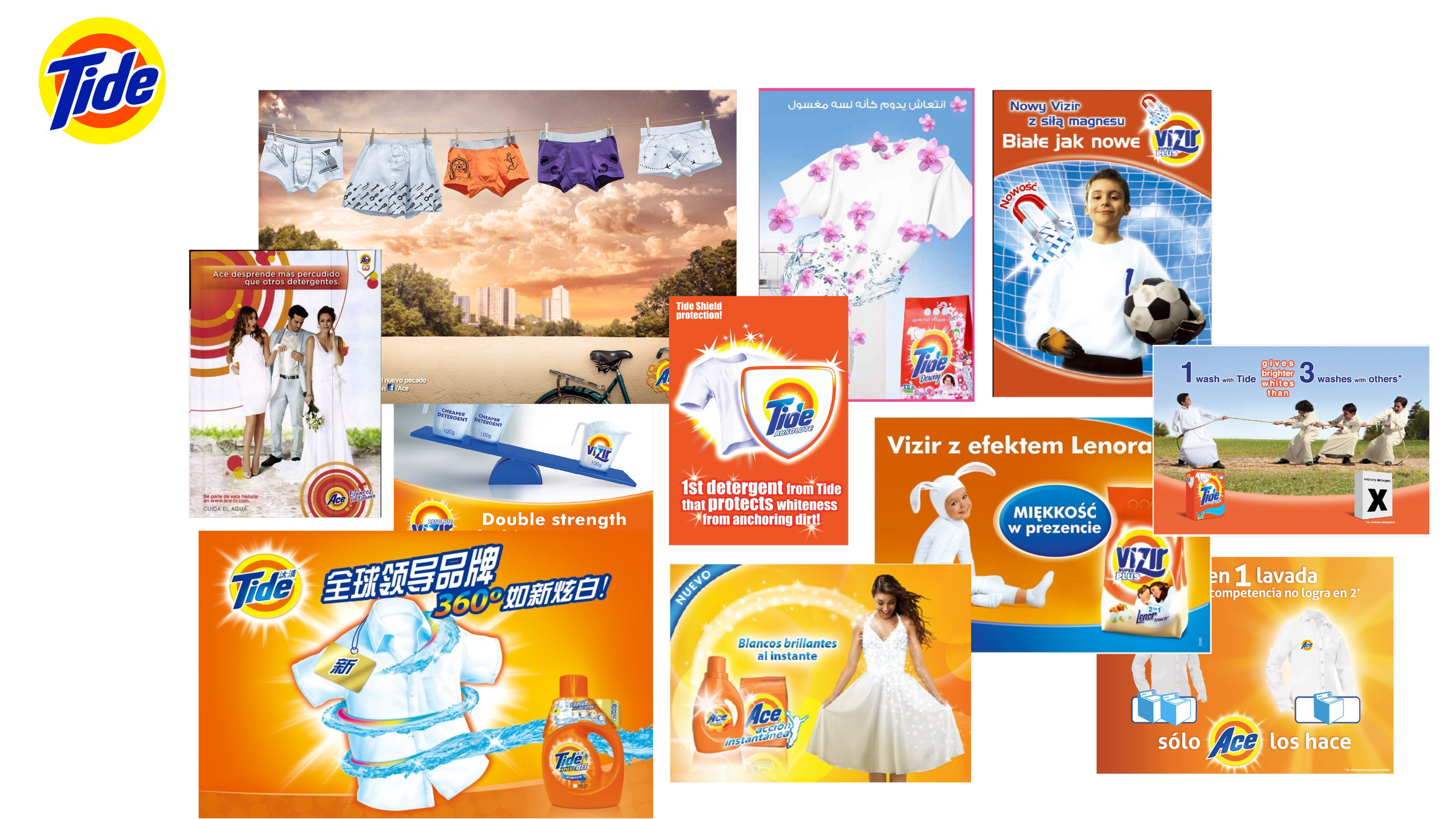
 Tide a.k.a. ACE, ALO, VIZIR, TIDE in other regions, needed a design refresh, locally led executions, indiscriminate asset proliferation and budget spent made the brand and it’s management become too complex.

Beside the iconic orange jug, tbe brand didn’t own any other familiar asset that could enable more holistic and iconic communication.  

Noise to Signal

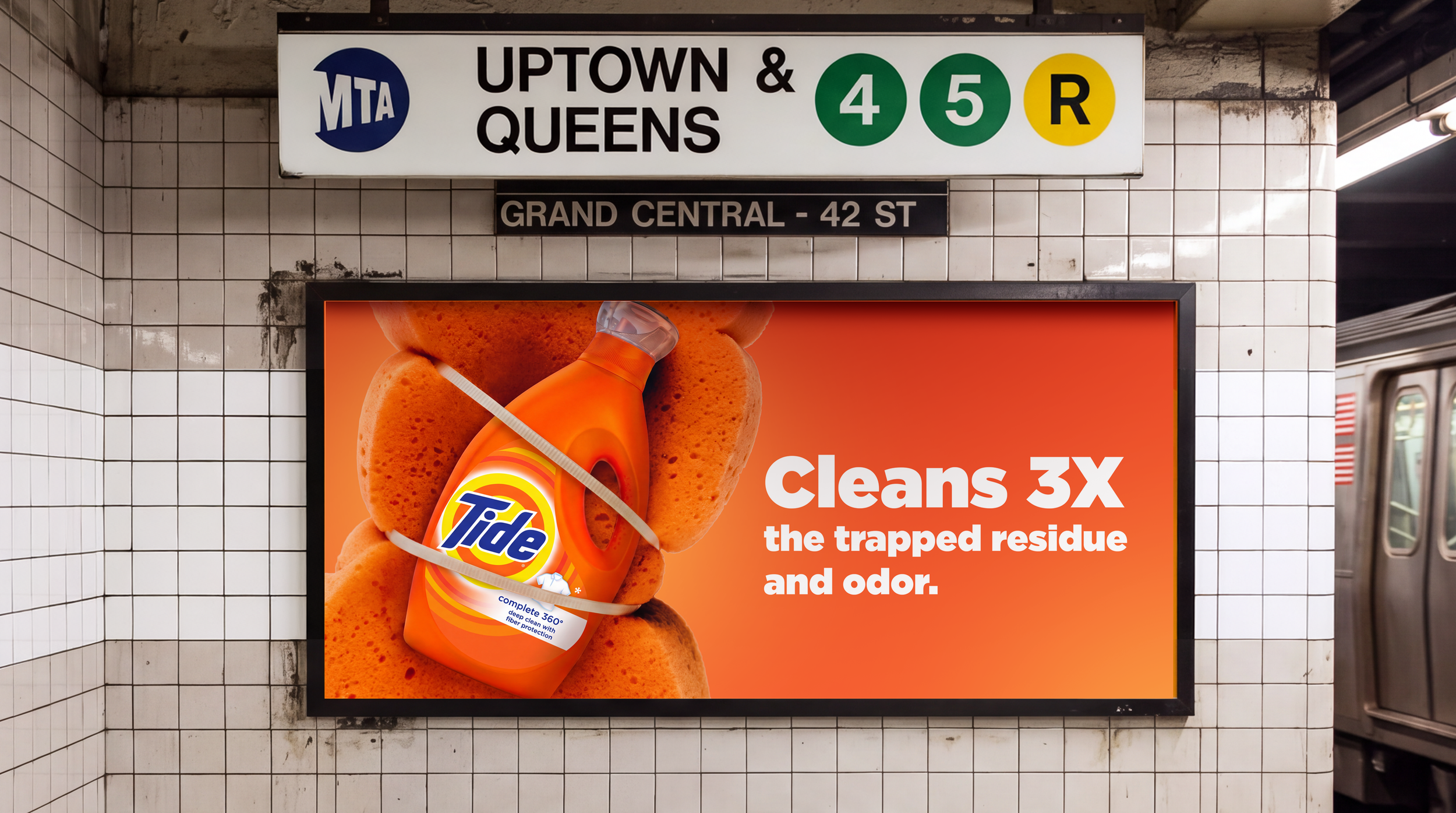
Simplify design language to amplify the brand’s iconic assets and connect with consumers leveraging a more vibrant, single-minded visual expression that’s efficiently scalable across markets whilst keeping local familiarity and relevance.
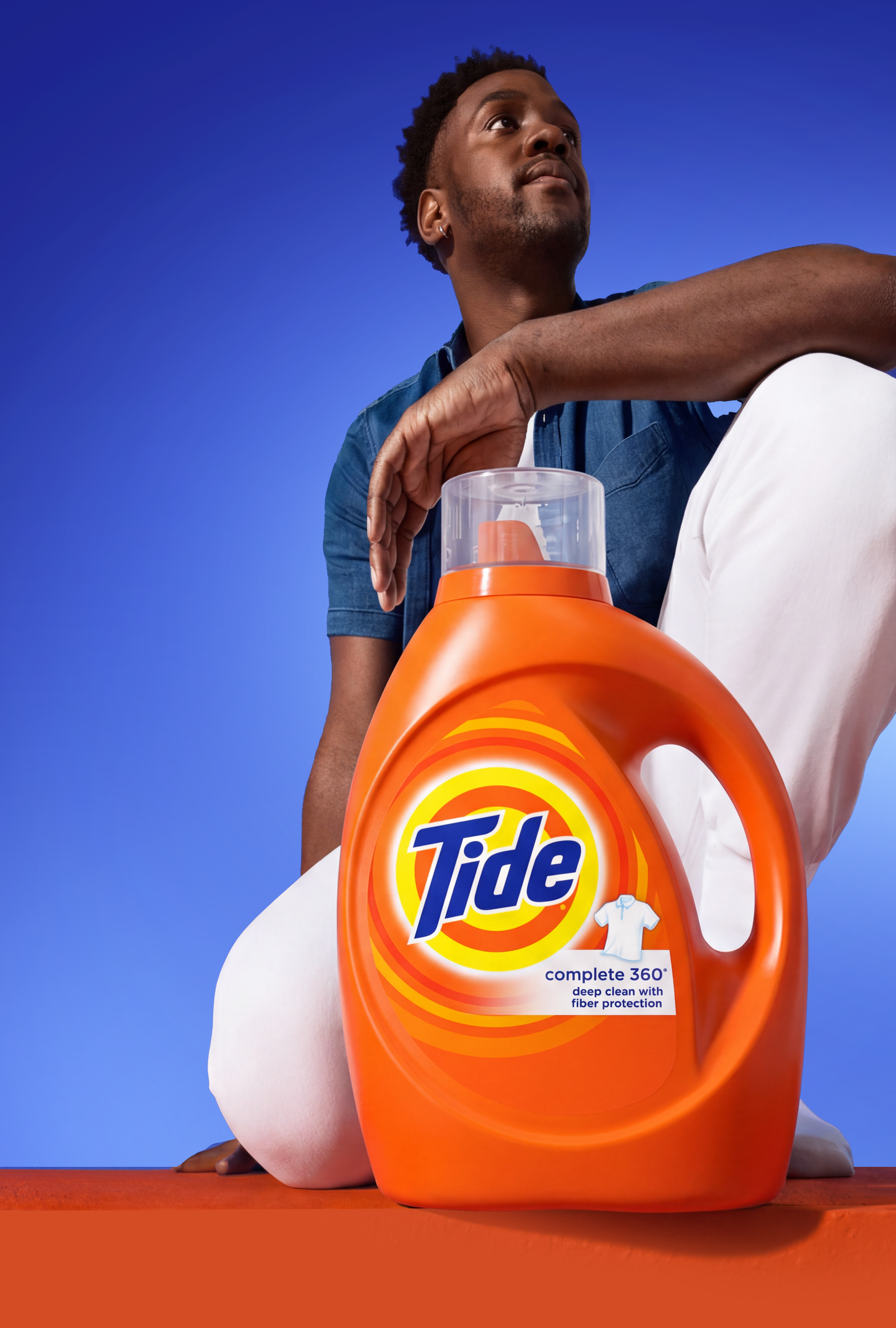

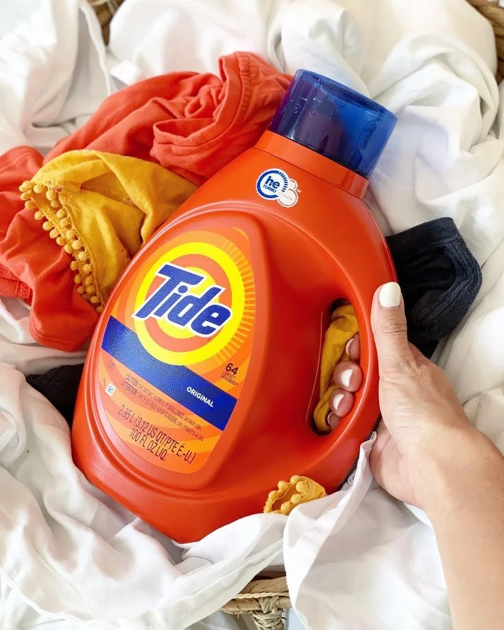
Man holding a large orange Tide laundry detergent jug against a blue background
Blue, orange, and white laundry detergent pod on an orange background
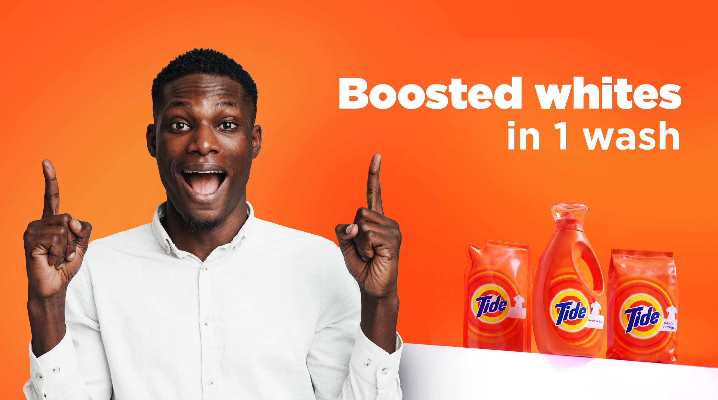
Smiling man in a white shirt beside Tide laundry detergent products with text reading “Boosted whites in 1 wash.”
Collage of Tide and Ace laundry detergent advertisements featuring clean clothes, detergent products, and promotional models.

from fragmented to holistically consistent
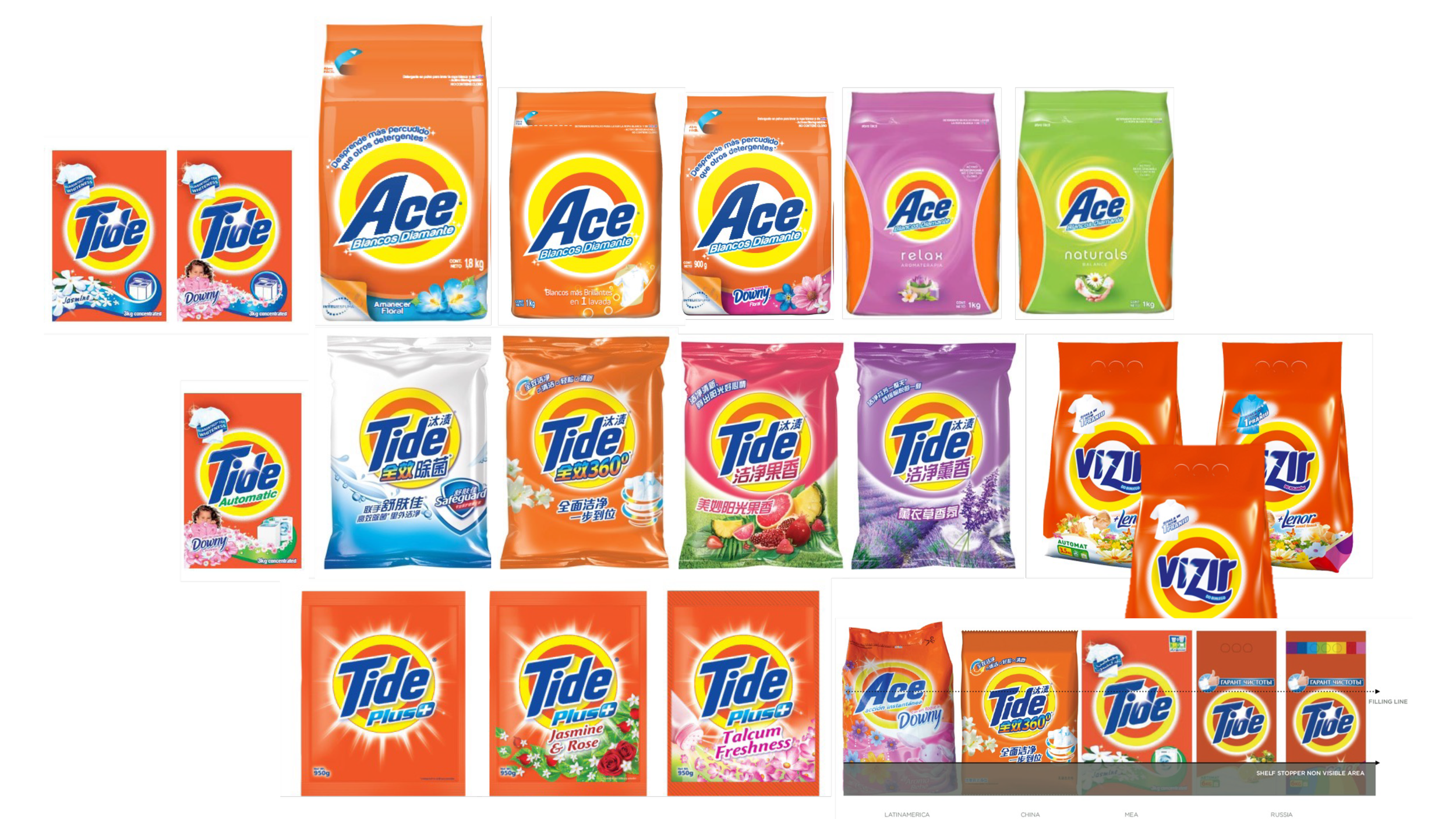
Collage of Tide, Ace, and Vizir laundry detergent packages in various colors, sizes, and fragrances.

Before

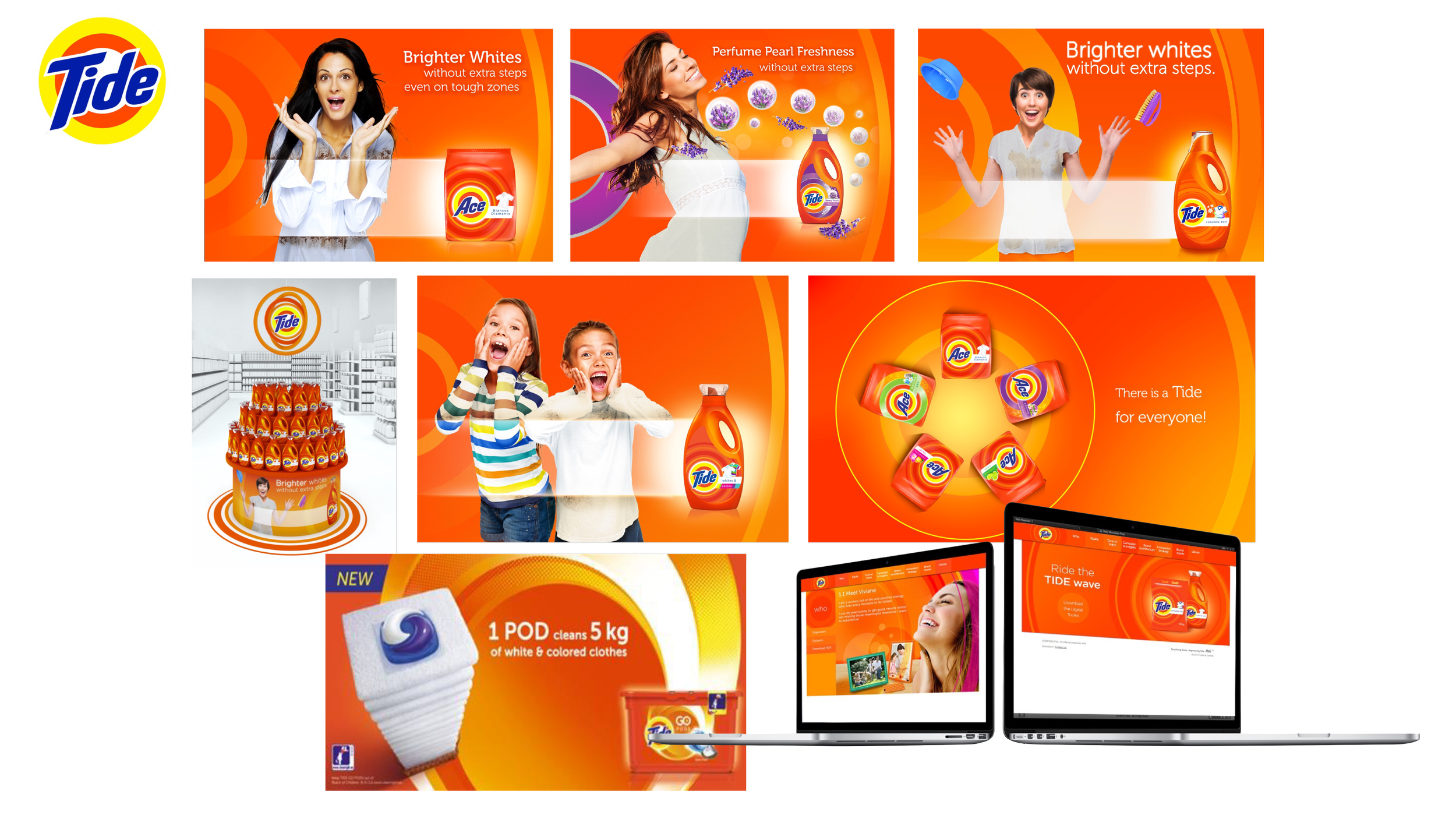
Collage of Tide and Ace laundry detergent advertisements featuring products, families, clean clothing, and branded campaign websites.
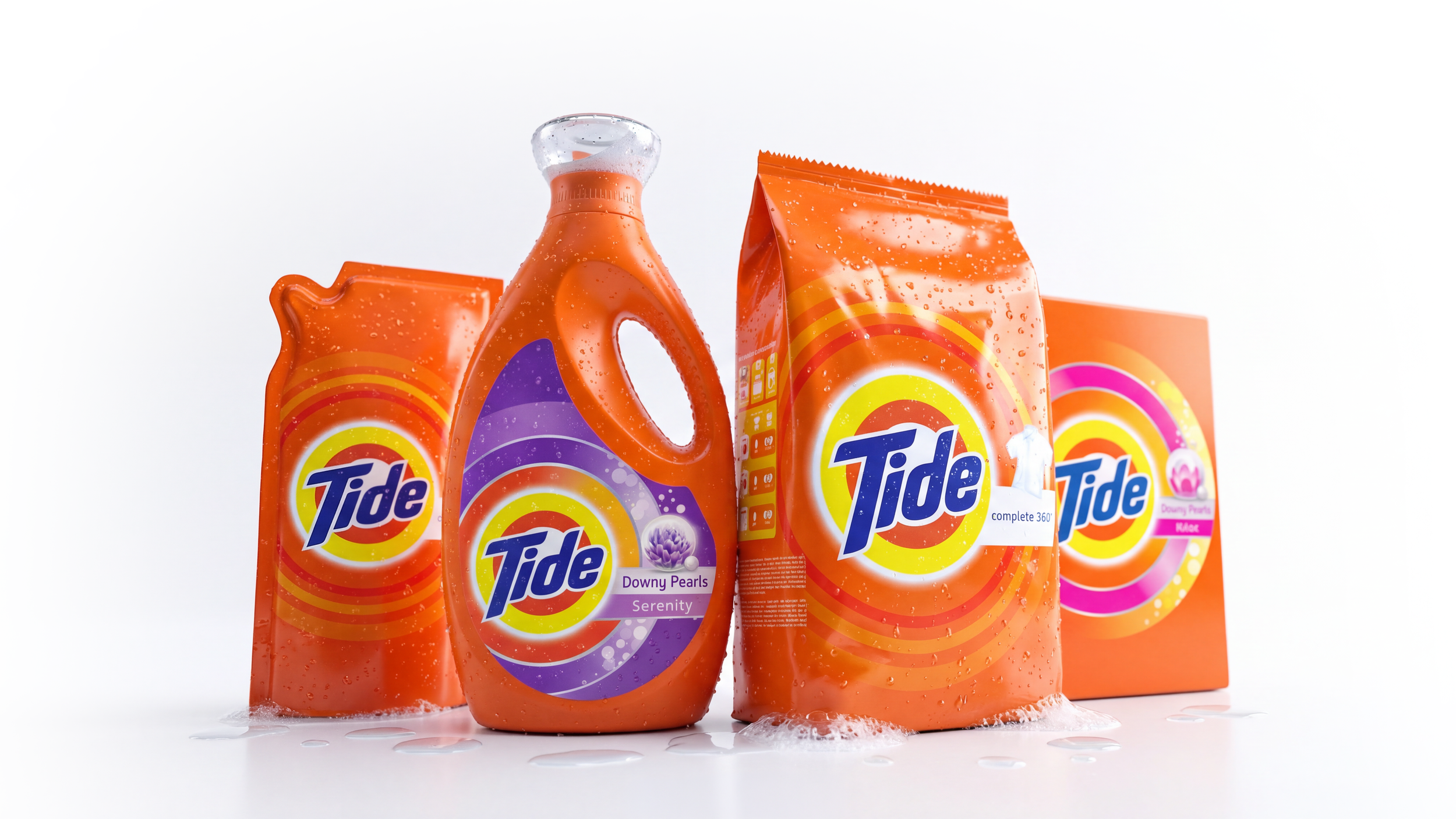
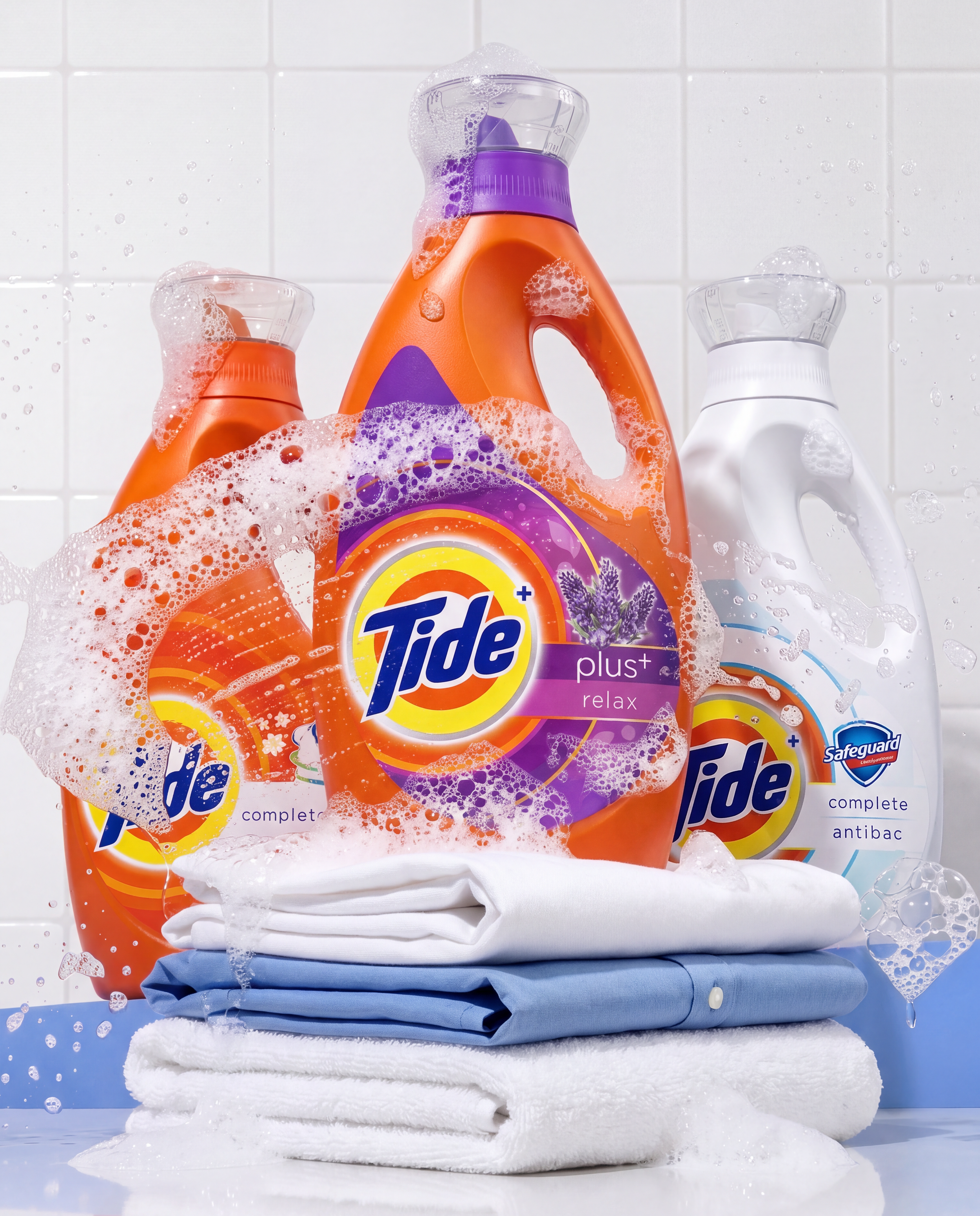
Assorted orange Tide laundry detergent bottles and packaging, including Downy Pearls Serenity, covered in water droplets on a white background.

After

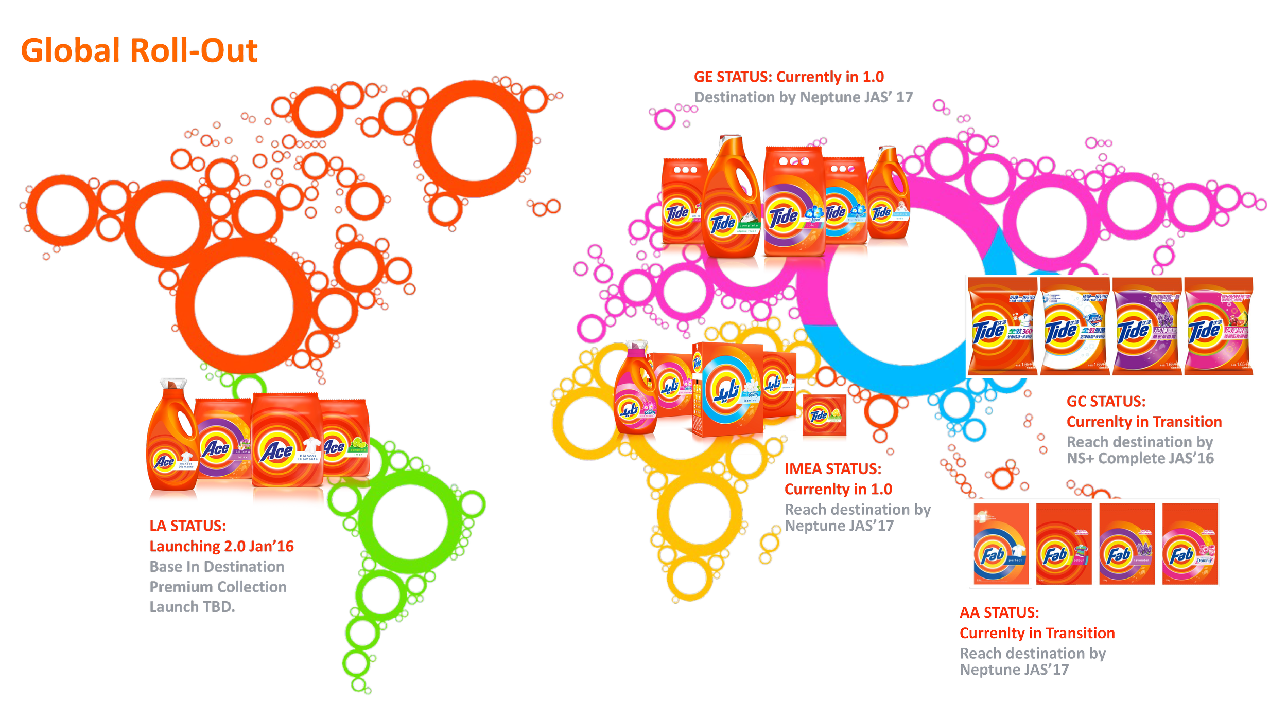
Global Roll-Out presentation slide showing Tide, Ace, Fab, and Chinese detergent product packaging with colorful ring graphics and regional launch status notes.
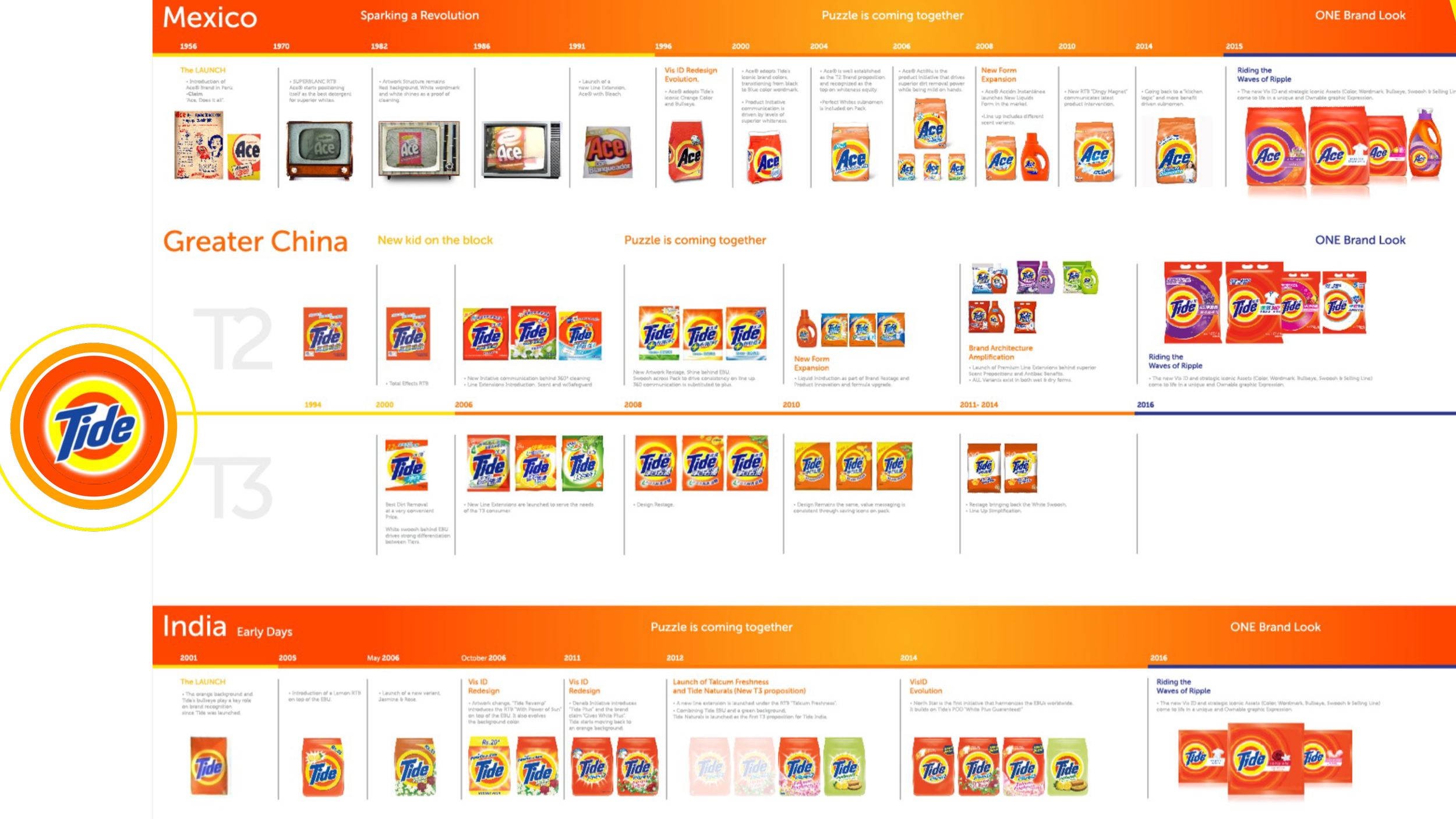
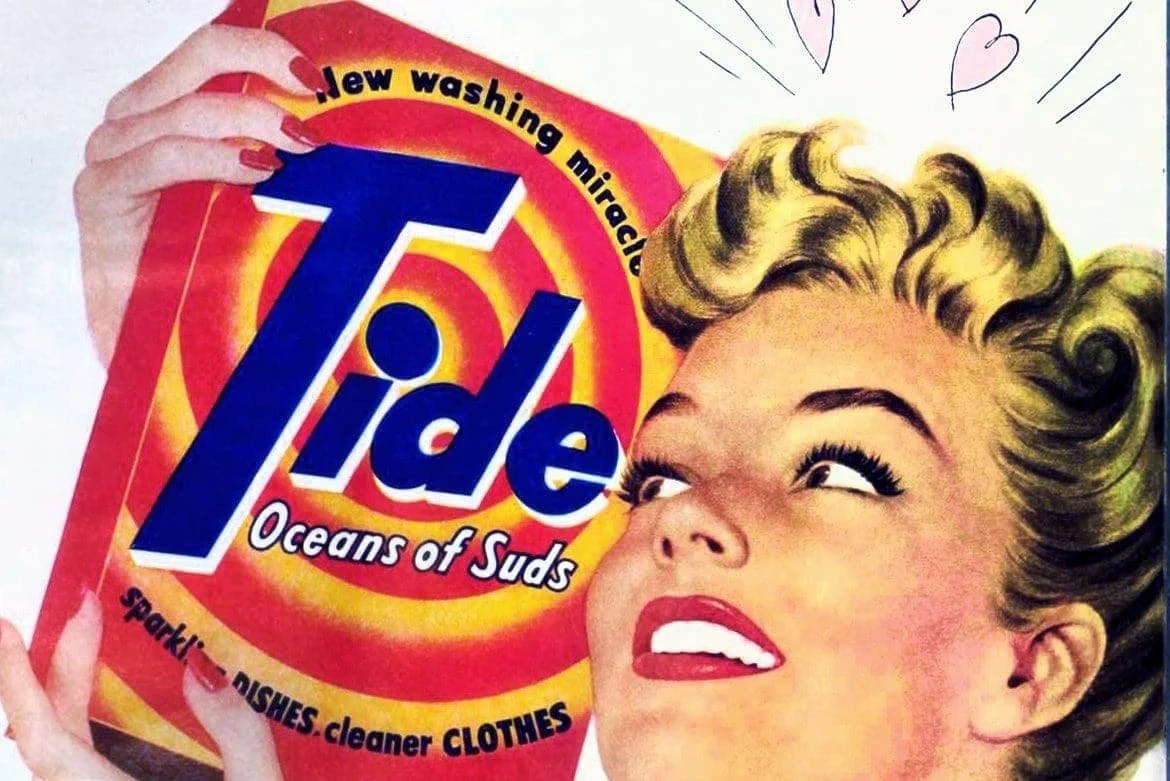
Tide and Ace laundry detergent brand evolution timeline across Mexico, Greater China, and India, showing packaging redesigns from the 1950s through 2016.
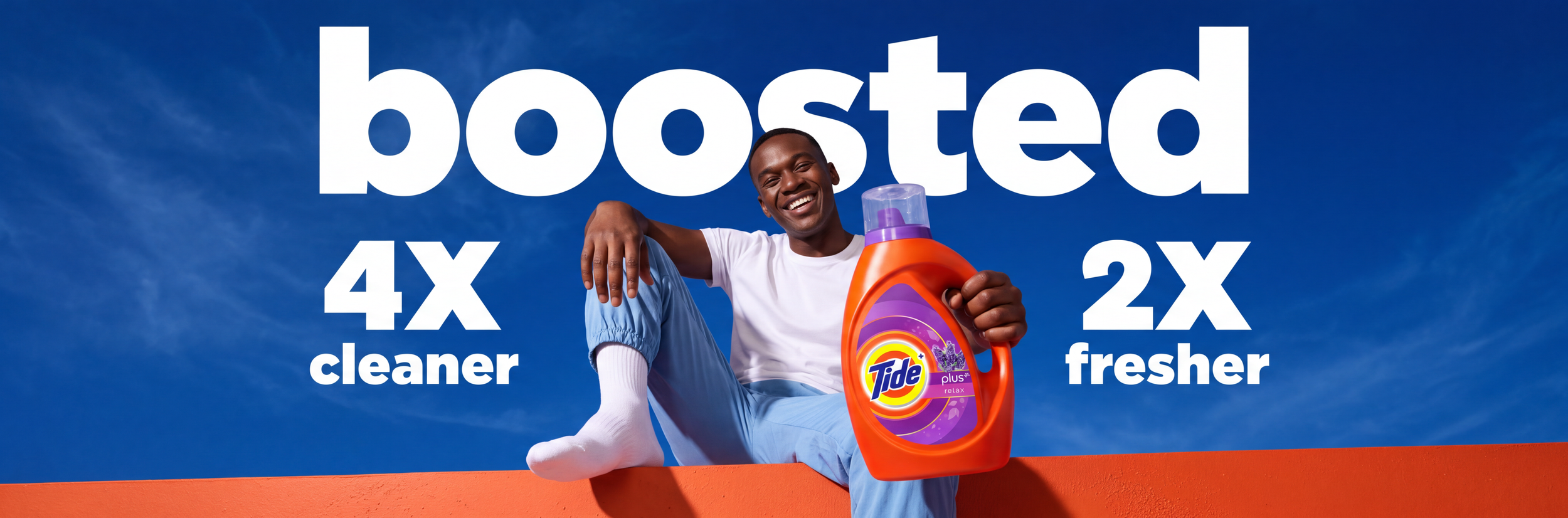
Tide laundry detergent advertisement featuring a smiling man holding a bottle with claims of 4x cleaner and 2x fresher.

A robust & ownable iconic system inspired from the Brand’s visual heritage: The Bull’s Eye.
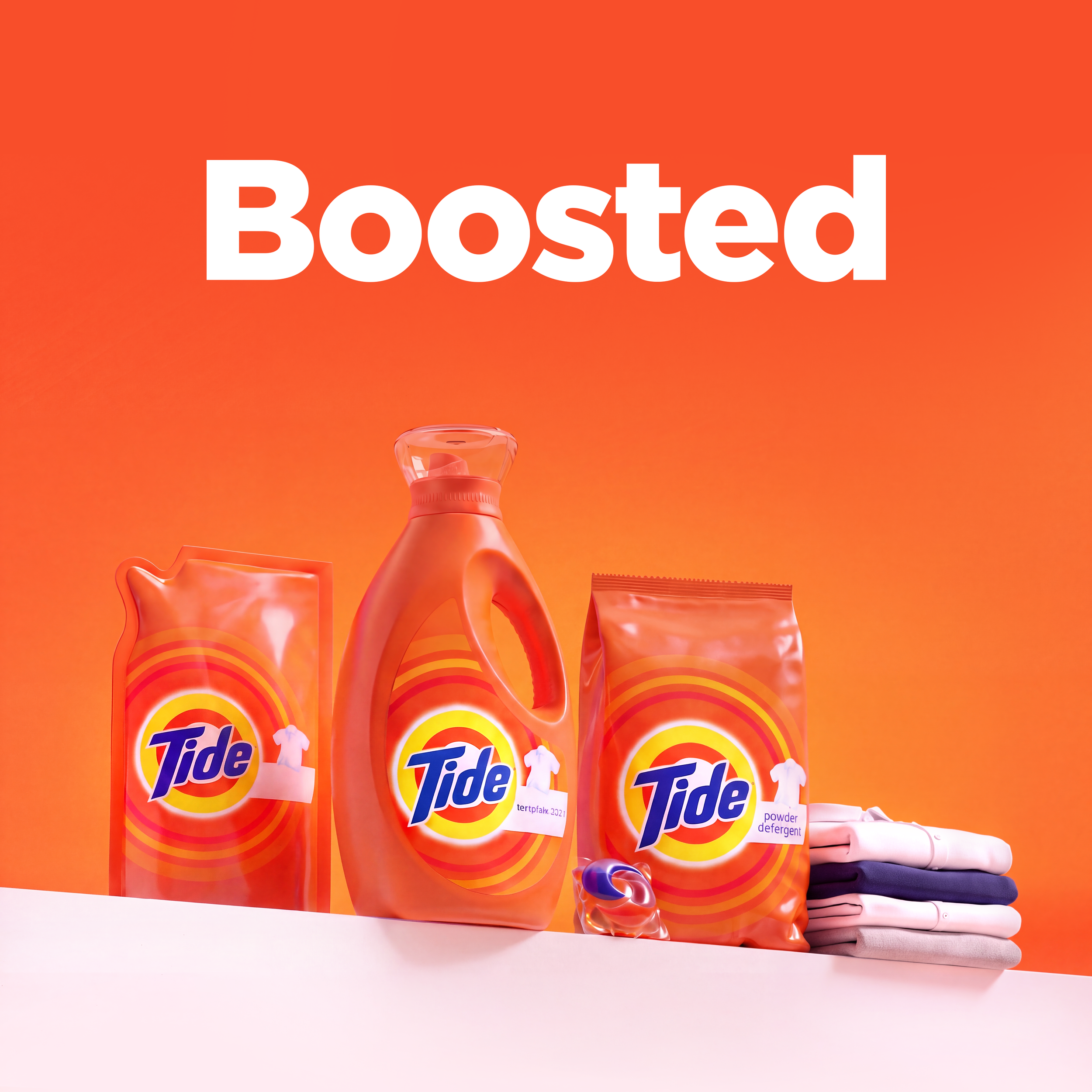
Tide laundry detergent products with pods and folded clothes beneath large white text reading “Boosted” on an orange background

Exceeded Success Criteria and built Stronger equity results with significantly higher Value Perception and Willingness to Buy

Drove ~$3.5MM in design costs Savings by simplifying regional artwork activities into a single VisId System.