The Challenge
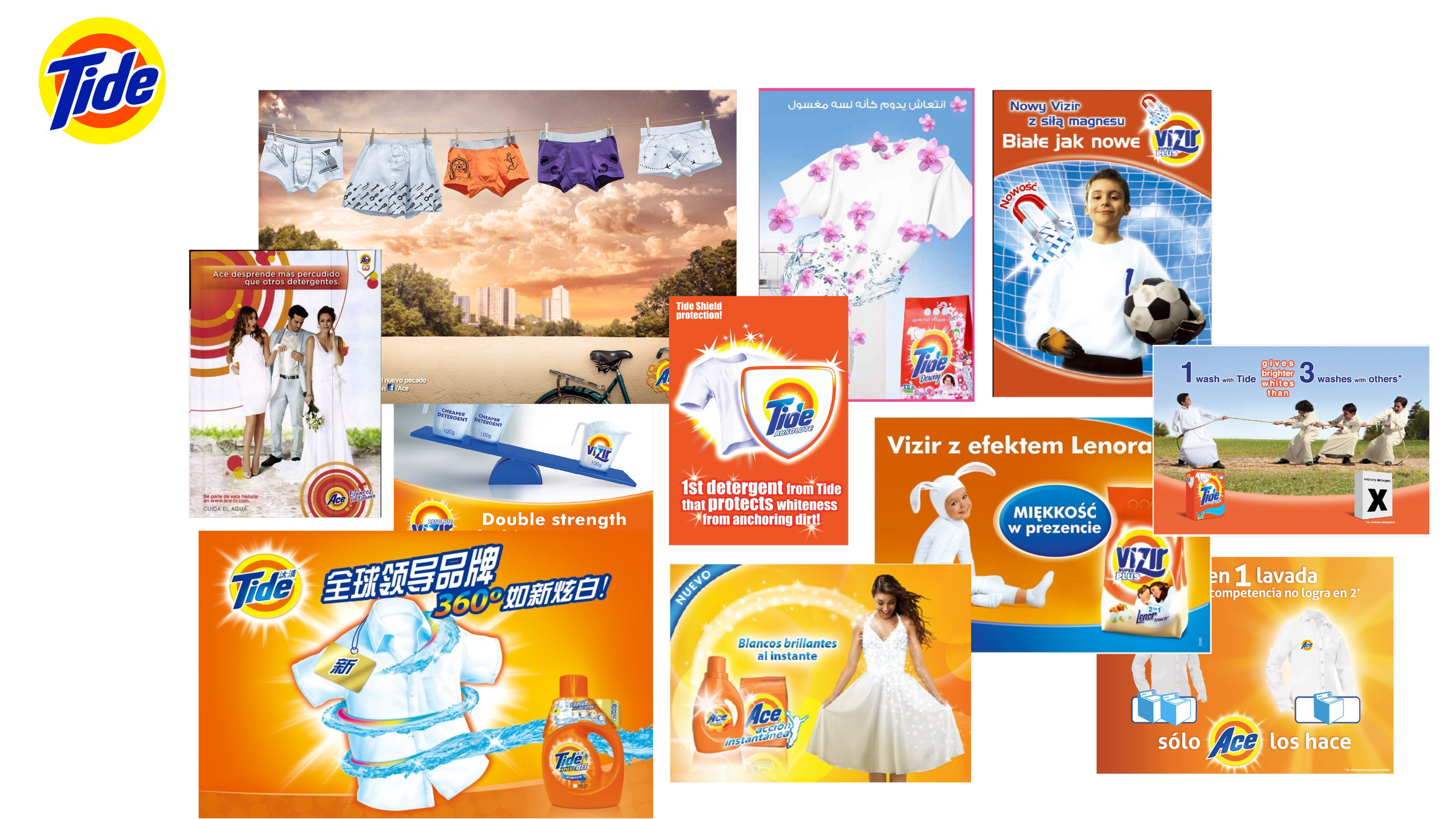
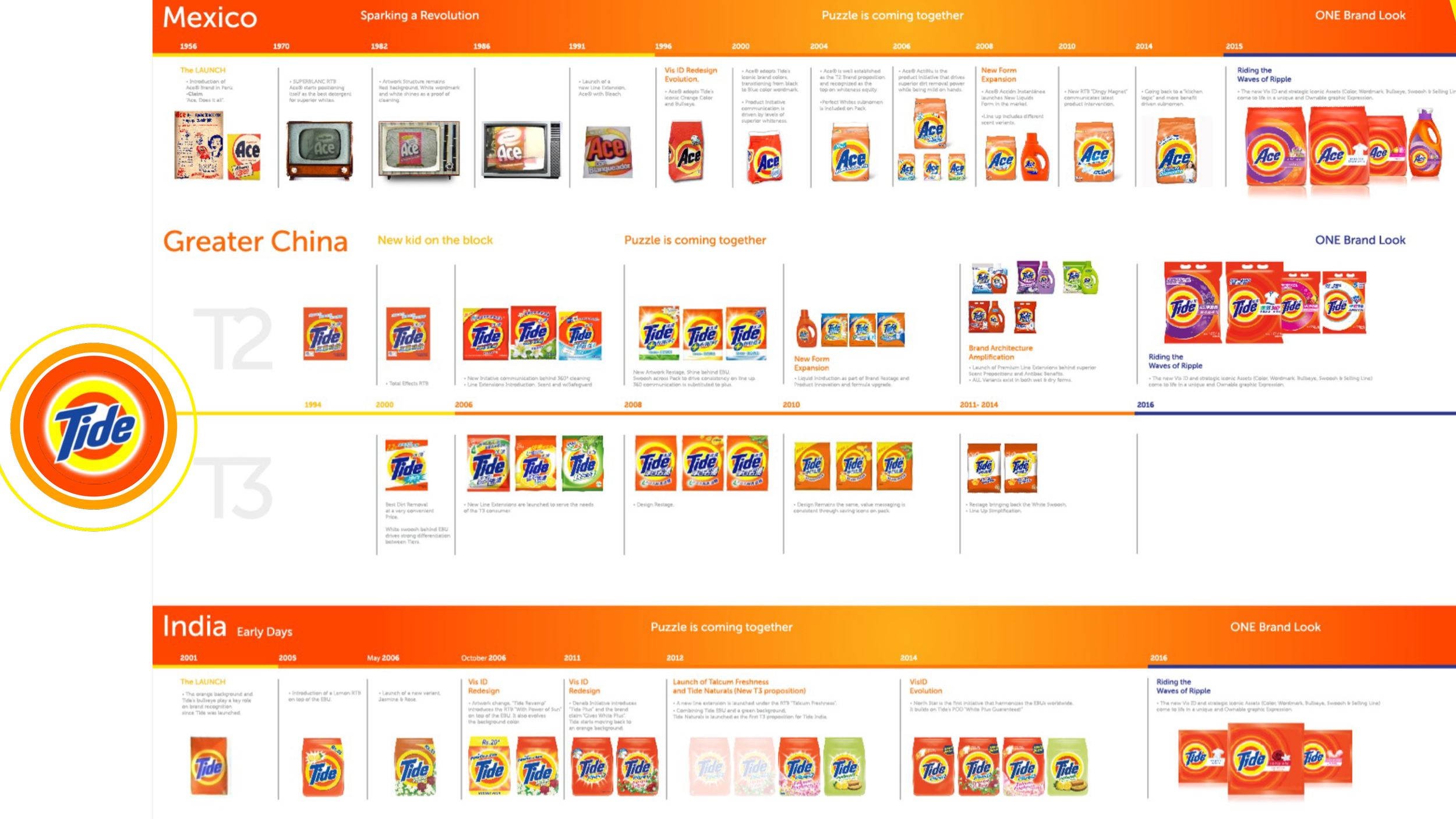
Tide a.k.a. ACE, ALO, VIZIR, TIDE in other regions, needed a design refresh, locally led executions, indiscriminate asset proliferation and budget spent made the brand and it’s management become too complex.
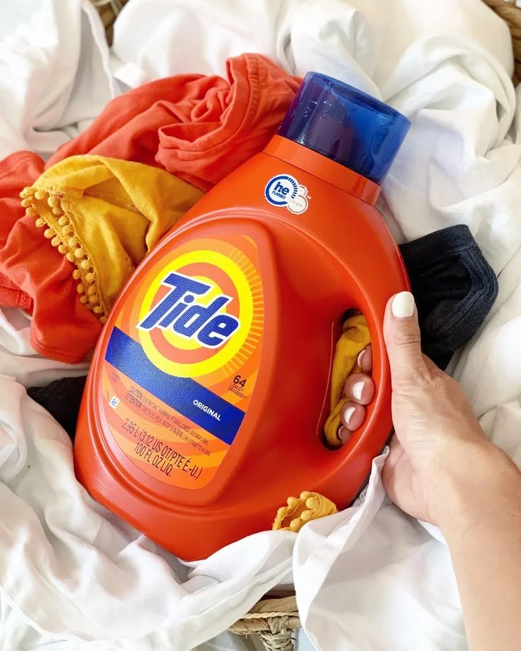
Beside the iconic orange jug, tbe brand didn’t own any other familiar asset that could enable more holistic and iconic communication.
Noise to Signal
Simplify design language to amplify the brand’s iconic assets and connect with consumers leveraging a more vibrant, single-minded visual expression that’s efficiently scalable across markets whilst keeping local familiarity and relevance.
-
Brand Architecture
-
Visual Identity
Packaging Design
Creative Direction
Brand Expression
Campaign
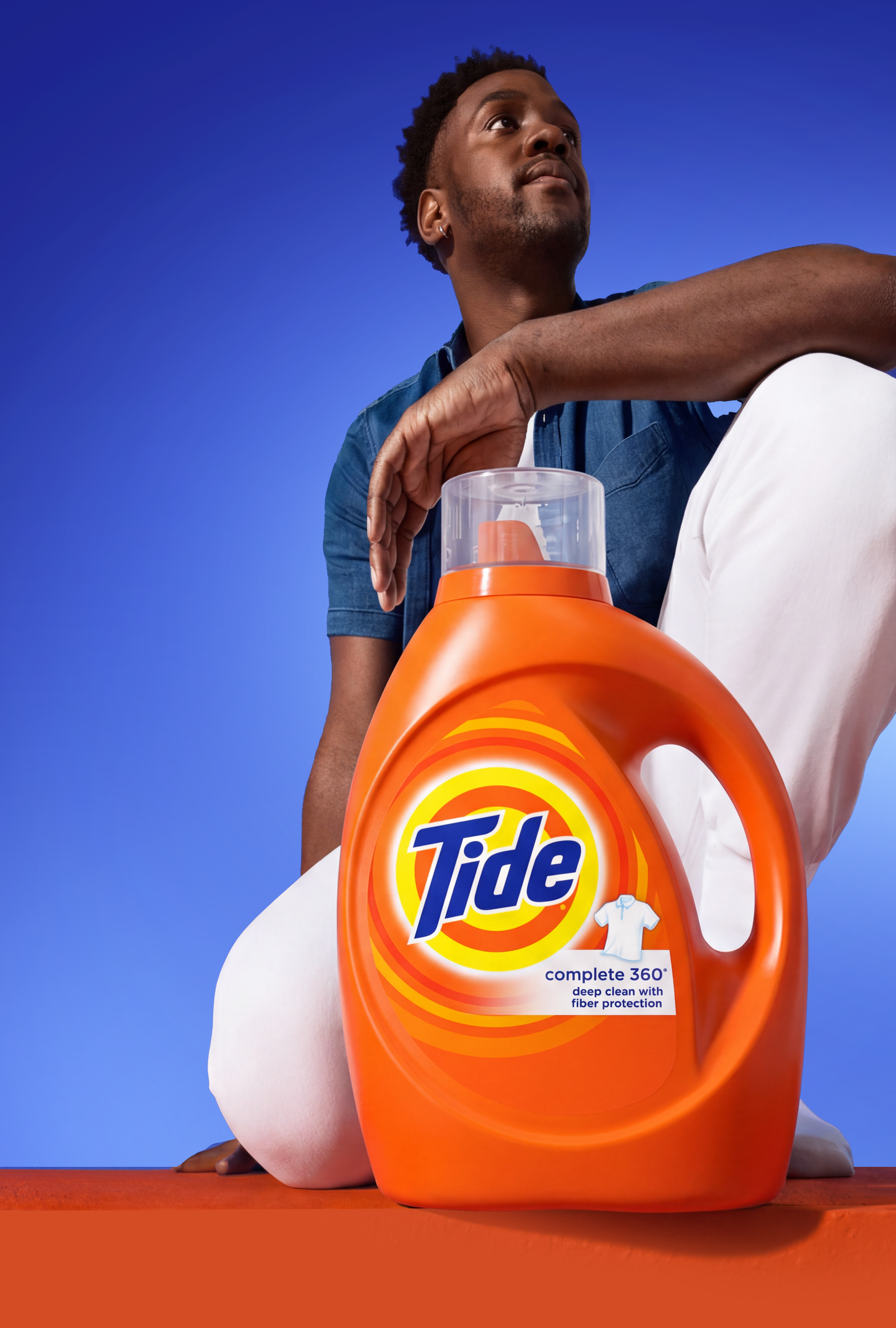


from fragmented to holistically consistent
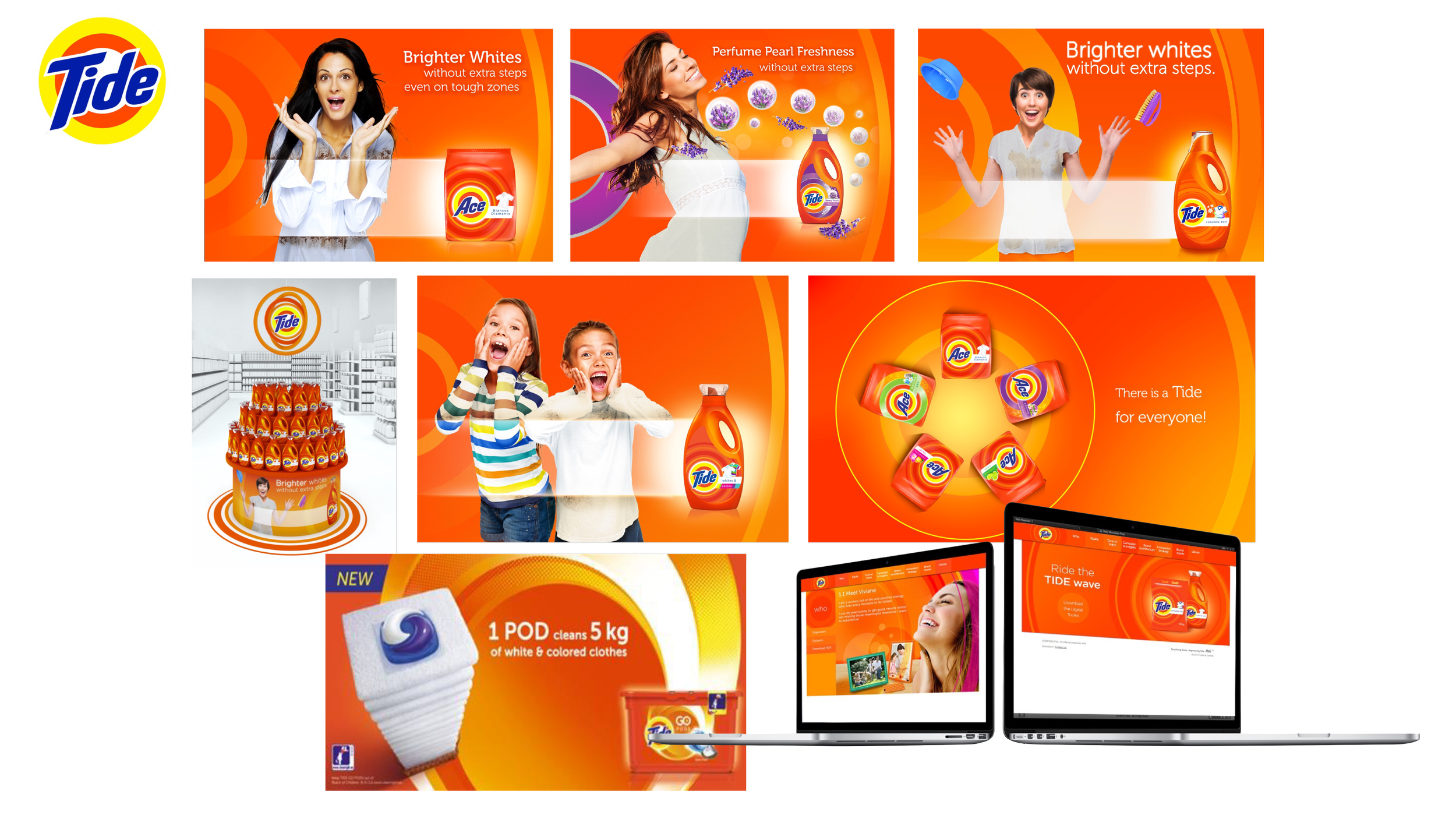
After
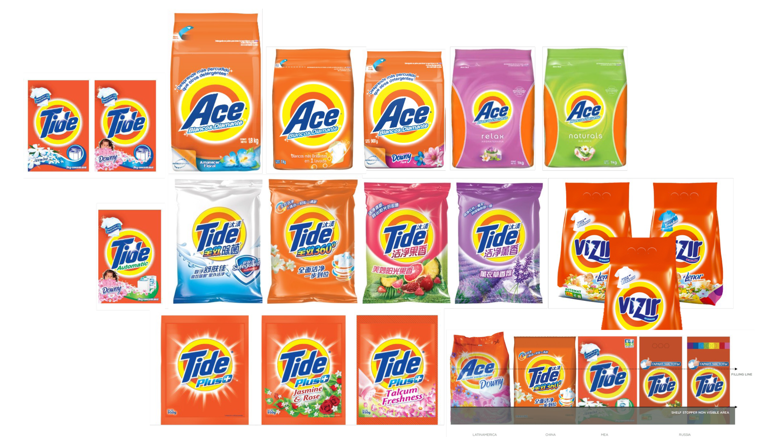
Before
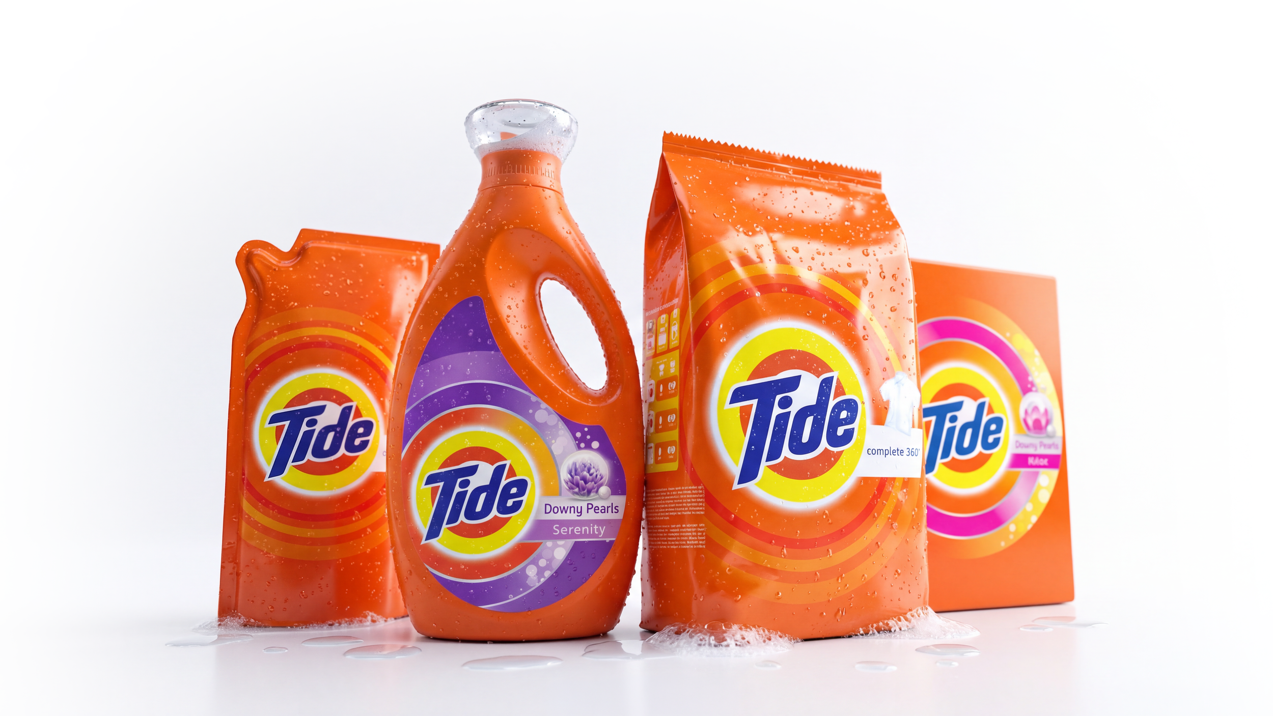
After
Before
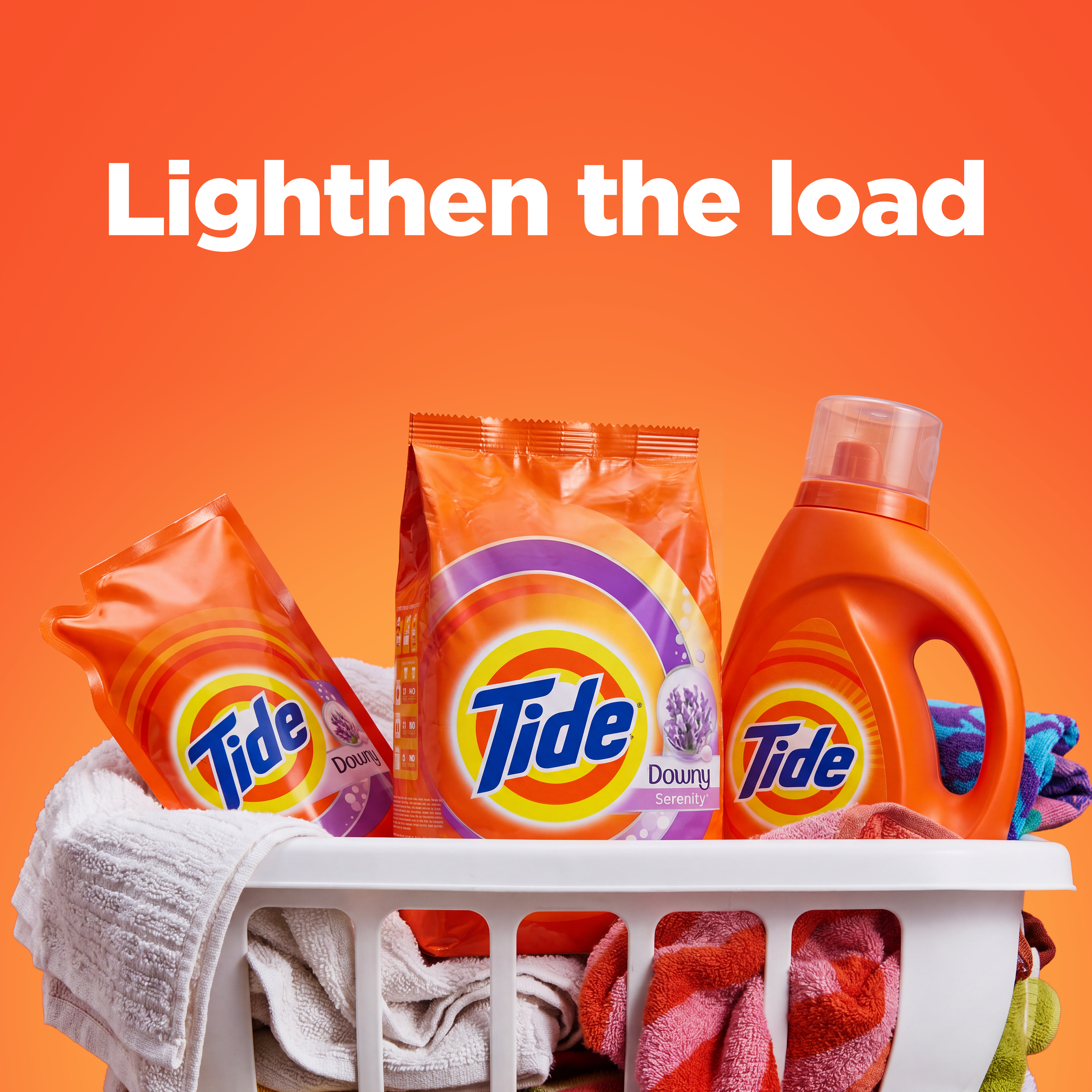
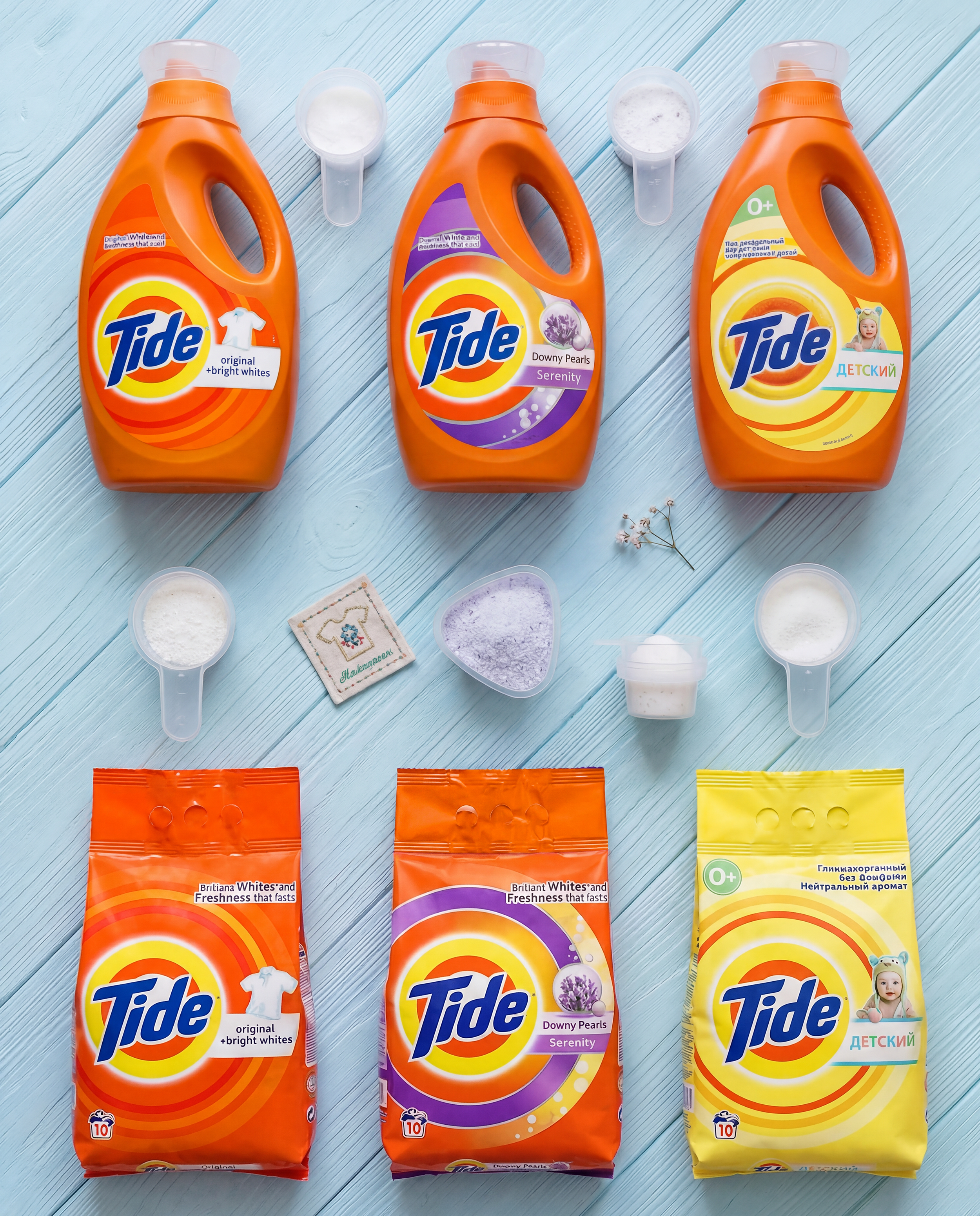
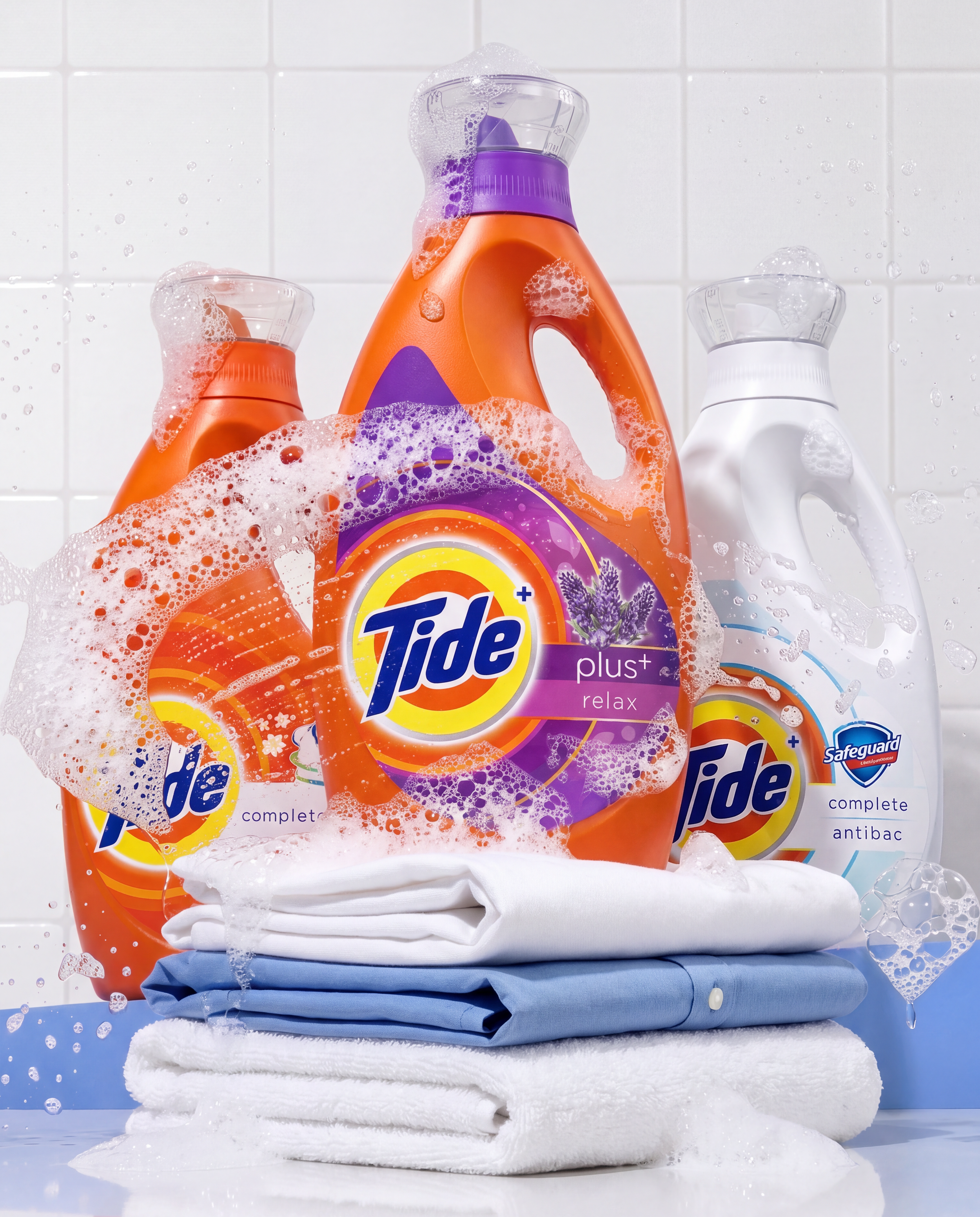

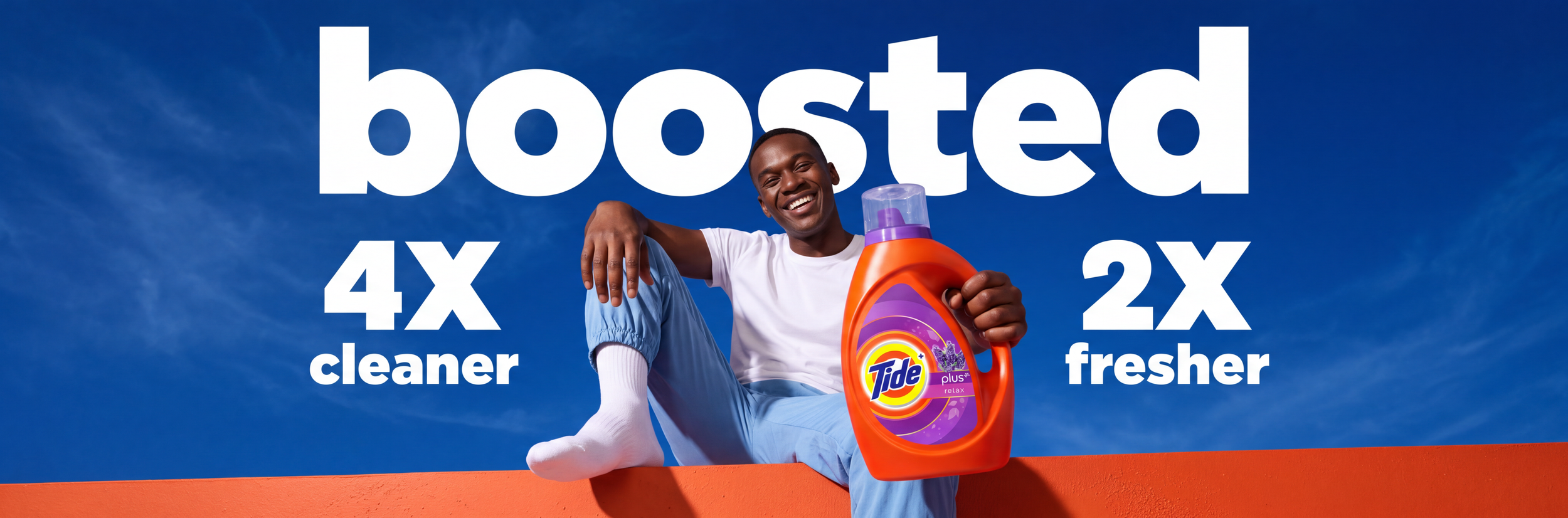
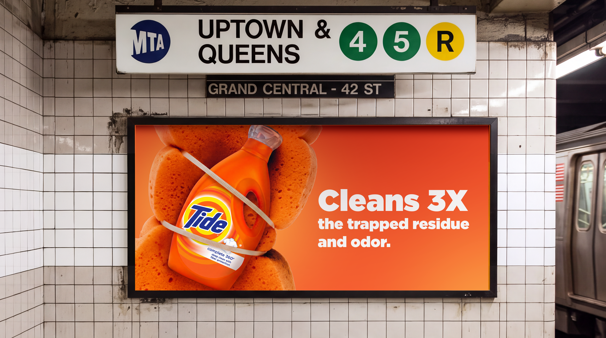
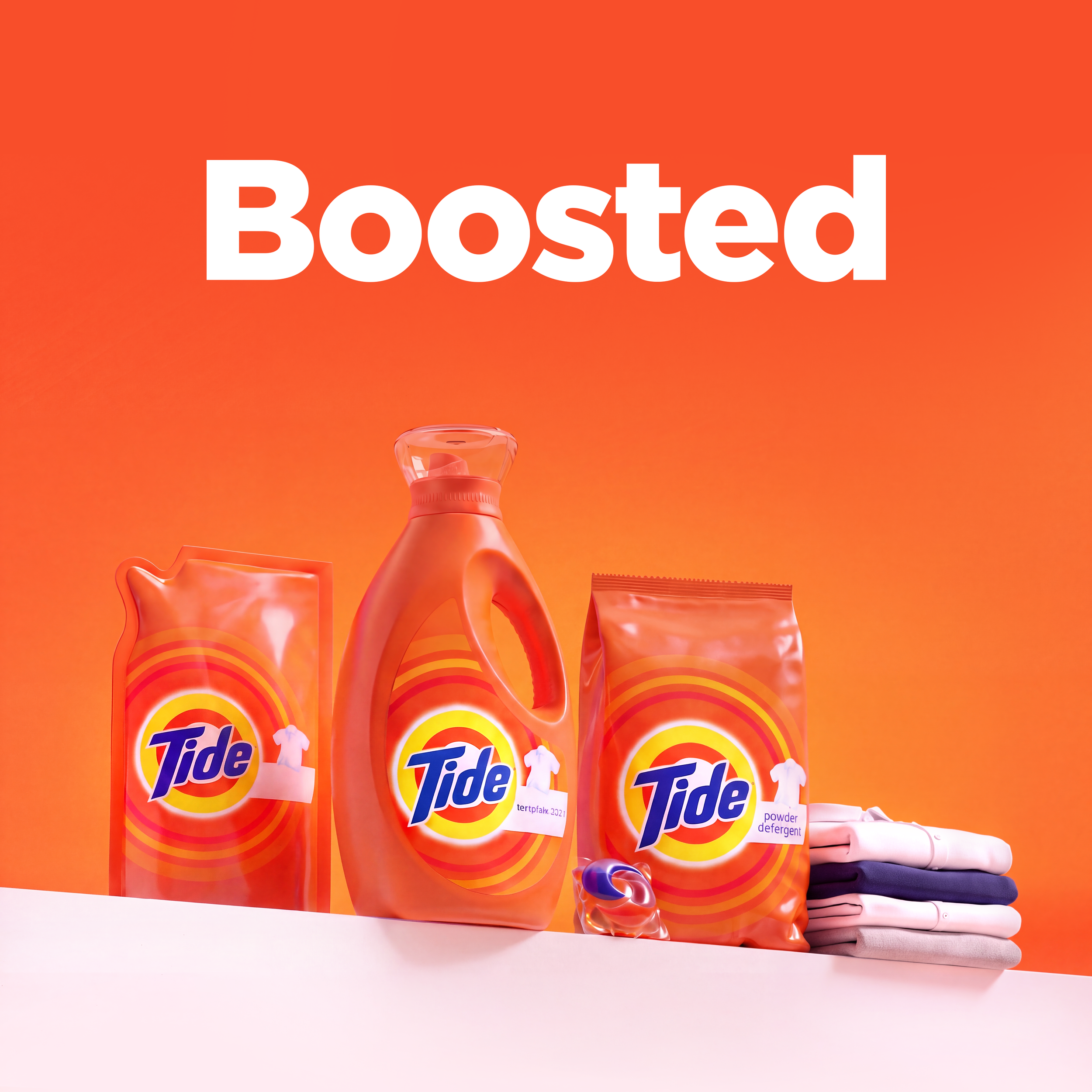
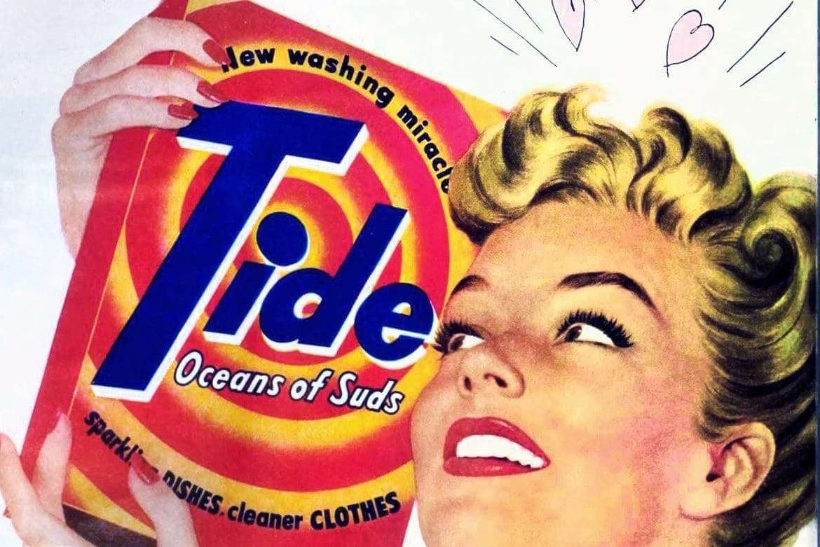
A robust & ownable iconic system inspired from the Brand’s visual heritage: The Bull’s Eye.
Exceeded Success Criteria and built Stronger equity results with significantly higher Value Perception and Willingness to Buy
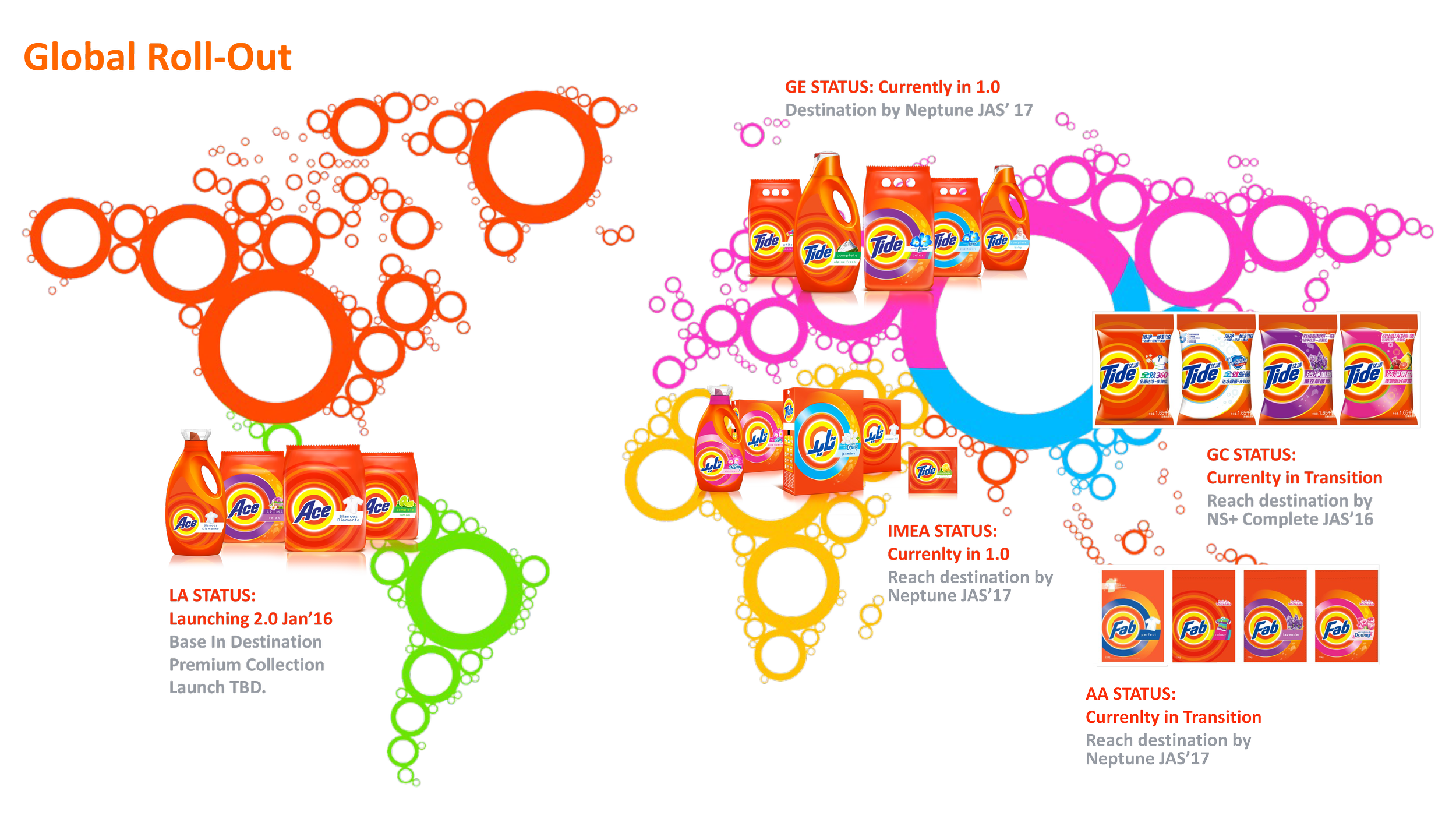
Drove ~$3.5MM in design costs Savings by simplifying regional artwork activities into a single VisId System.